The Model 3 Interior Already has a Dispute
We have been shown what the Tesla Model 3 should look like including how the dashboard will look and feel and this part of the interior has already become a topic of hot dispute. The fact that over 400,000 people signed up when the Model 3 was presented for preorders. These folks signed up for a promise of a car that would be the most affordable EV model to ever hit the roads with the range most people want, but there are some items that may turn some of while being exactly what some desire.
Tesla has made a habit of showing us advanced technology, giving impressive features that are easy to be engaged with and providing us with more of what we want in the cars that are for sale. With the Model 3 coming to the market we expect this car to be a smaller version of the Model S for those of us who aren’t shopping in the high end luxury market, but the Model 3 will have some items that are singular to it and may eventually make their way up the market to the Model S or the Model X.
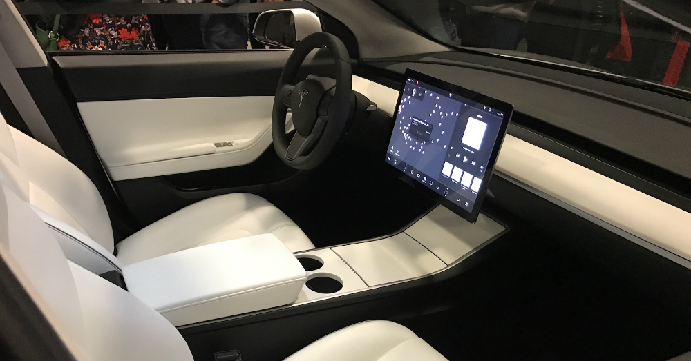
The Tesla Model 3 offers you one of the most boring dashboards you’ve ever seen. This is on purpose. The only screen in the Model 3 is going to be a large control center which is where everything will be displayed for you. There won’t be a gauge cluster in front of you as the driver or even a speedometer that’s put where you can see it by glancing down. You might expect this car to at least have a Head Up Display for you, but it won’t have that either, making you look at the center screen for your speed and gauge information.
The conversation regarding the dashboard layout has already been discussed on Twitter with many reaching out to Elon Musk for their concerns about the dashboard, but he has informed them there won’t be a speedometer, there won’t be a HUD and there will be a step toward offering an autonomous car as the Model 3, which means you need less control elements and readouts in the car. Regardless of the concerns on Twitter, Musk has held to the thought that the Model 3 will have only the one screen for everything you need inside the car.
If you happen to be one of the folks that have put their money into the deposit of the Model 3 you might enjoy the simplistic design that’s only interrupted with this one screen, but you also may be completely turned off by it. I’m not sure there were any expectations that Tesla would make the Model 3 a polarizing car, but it certainly is just that. This car is one that feels like it will be the catalyst for success or failure for Tesla and even these design and control elements may lead the company down the wrong road.
This post may contain affiliate links. Meaning a commission is given should you decide to make a purchase through these links, at no cost to you. All products shown are researched and tested to give an accurate review for you.


